Built in public

Site Evolution

This site is a record of what I kept asking for, what I changed my mind about, and what I finally removed. AI-assisted development made each pass faster. It did not supply the taste, sequencing, or product calls.

70

Merged PRs

9

Months

14

Major turns

What changed

A release log for my own taste.

Nine months is long enough for a personal site to accumulate good work, stale assumptions, and technically finished ideas that no longer deserve the same attention. The pattern is visible in every pass: respond to what feels too generic, too static, too thin, or too heavy for the job.

Editorial rule

This is a curated story, not a live PR feed. It does not need every commit. It needs the product choices: how I used AI-assisted development to steer a personal site toward a clearer point of view.

v0.1ManualPR #1
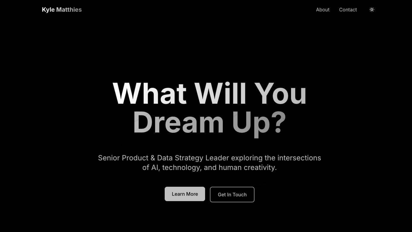
The original dark homepage with the headline What Will You Dream Up?

Dark Theme Launch

I use dark mode almost everywhere outside the office suite, so I wanted the first version of my personal site to feel native to the way I actually work.

What I wanted

The intent was not just to make the site dark. I wanted a visual baseline that felt technical, focused, and a little more product-like than a standard personal homepage.

What it changed

That early choice gave the site a foundation I could keep building on: high contrast, quiet motion, and enough surface area for future modules.

launchvisual system
v0.2ManualPR #7

Agent Bible Goes Interactive

The Agent Bible was never meant to become the main feature of the site. It was a place to test how an interactive module could make dense AI material easier to explore.

What I wanted

I started with a simple browsable list, then kept adding structure: use cases, relationships, filters, and a graph. I wanted the information to feel playable.

What it changed

The lesson was useful. Static lists explain. Interactive systems invite people to look around and form their own map.

interactiveAI systems
v0.3ManualPR #17

MDX Pipeline Separation

As the writing section grew, I needed a cleaner way for posts to live as content files and still render properly inside the site.

What I wanted

The alternative was more one-off page wiring and content logic leaking into places it did not belong. MDX let me keep posts as files while the UI handled layout, metadata, and rendering.

What it changed

I am not an architecture expert, but the product instinct was clear: make the publishing path repeatable before the writing volume exposed every shortcut.

architecturecontent
v0.4ManualPR #23
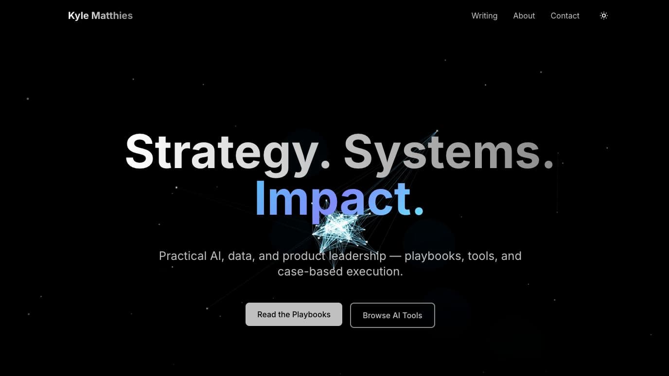
The 3D homepage hero with Strategy, Systems, Impact over a network graphic

3D Hero Redesign

From the beginning I wanted a modern, dark-first site. The first version got the structure in place; this pass made the homepage feel closer to the version in my head.

What I wanted

I had planned to come back with a more ambitious animation layer once the site had enough shape. The 3D hero was that moment: a major UI overhaul, not a decorative flourish.

What it changed

It pushed the site away from static portfolio energy and toward something that felt more like an AI-native product surface.

homepagemotion
v0.5ManualPR #25

AI Tools Directory

The AI tools directory started as a fun mini project: take the tools I had actually saved, tried, and paid for, then turn that mess into a usable personal stack.

What I wanted

I used a bookmark export to find AI tools I had collected over time and paired that with spending history to separate casual interest from real usage signal.

What it changed

That became the product idea: not another generic tools list, but a tiered view of my own practical fluency and where I had the most reps.

directoryproduct UI
v0.6ManualPR #29

The AI 360 Section

As I wrote more, I wanted a home for sharper AI thoughts that did not all need to behave like standard essays.

What I wanted

The goal was to create a recurring editorial surface: more opinionated than a directory, more structured than a feed, and better suited to the way I think through AI shifts.

What it changed

The site started to separate modes of thinking: projects, essays, tools, and a more direct point-of-view section.

editorialinformation architecture
v0.7DevinPR #37
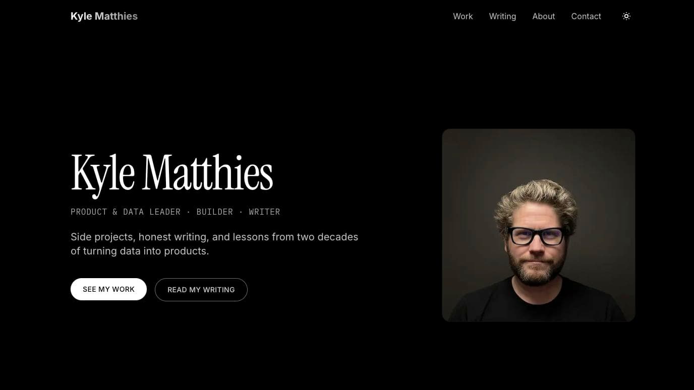
The person-first homepage with Kyle’s portrait beside the main introduction

Person-First Rebrand

The more I wrote, the more the site started to feel too sterile. It needed more of me in it.

What I wanted

I added personal photos, family context, and more specific proof because the site should not read like a generic AI portfolio. It should feel like it belongs to one person.

What it changed

That changed the emotional temperature of the site. Less template. More operator, parent, builder, and product person.

brandhomepage
v0.8DevinPR #40

About Page Narrative

The About page kept evolving because the site needed to explain more than what I do. It needed to explain how I think.

What I wanted

I wanted the page to carry the working style: framing problems, owning loops, building thin slices, and using AI as leverage without pretending the tool has the taste.

What it changed

It became the bridge between the personal story and the product thesis behind the rest of the site.

aboutnarrative
v0.9ClaudePR #42

Theme System

Dark mode is my default, but it is not everyone else's. At some point the site needed to respect that.

What I wanted

The toggle looked straightforward from the outside. The useful work was finding every place where the UI did not adapt cleanly and tightening the design tokens until both modes held up.

What it changed

That made the design system more honest. A theme toggle exposes shortcuts fast.

themesystem
v1.0ClaudePR #51

Newsletter System

The newsletter was about turning the site into more of an owned channel, but I wanted the implementation to match the weight of the app.

What I wanted

LineupSnap uses a fuller backend pattern for invites and registration. This site did not need that level of machinery, so I used Resend for a lighter subscribe and unsubscribe flow.

What it changed

The result was a practical product loop without pretending this frontend-heavy site needed a full application backend.

newsletterproduct loop
v1.1CodexPR #67

The Process Became a Page

The evolution timeline started as a private review surface. Building it exposed a useful truth: the site itself was one of the clearest examples of my product process.

What I wanted

I wanted to show the sequence of decisions without turning the page into a self-congratulatory changelog. The useful story was what felt wrong, what changed, and what each pass taught me.

What it changed

The release history became evidence for the working style described on the About page, even before I was ready to make it public.

storytellingproduct process
v1.2ClaudePR #70

Projects Became Evidence

The project grid had become a set of logos. The next pass added the actual sparks, product decisions, technology choices, and lessons behind the work.

What I wanted

I wanted the portfolio to answer a harder question than “what did you build?” It needed to show why each project existed and what changed in my judgment because I shipped it.

What it changed

Small personal builds moved from decoration to proof. The page started showing a repeatable pattern across coaching, family, product work, and AI-assisted development.

portfoliocase studies
v1.3ClaudePR #74

Distribution and Feedback Loops

Publishing was no longer enough. The site needed a way to stage broadcasts, learn what readers used, and catch failures without loading production with unnecessary weight.

What I wanted

The job was to add observability and newsletter operations in proportion to a personal site: useful when configured, close to zero cost when they were not.

What it changed

The site gained an owned distribution loop, analytics, and error monitoring while preserving the lightweight public experience.

distributionobservability
v1.4CodexPR #75
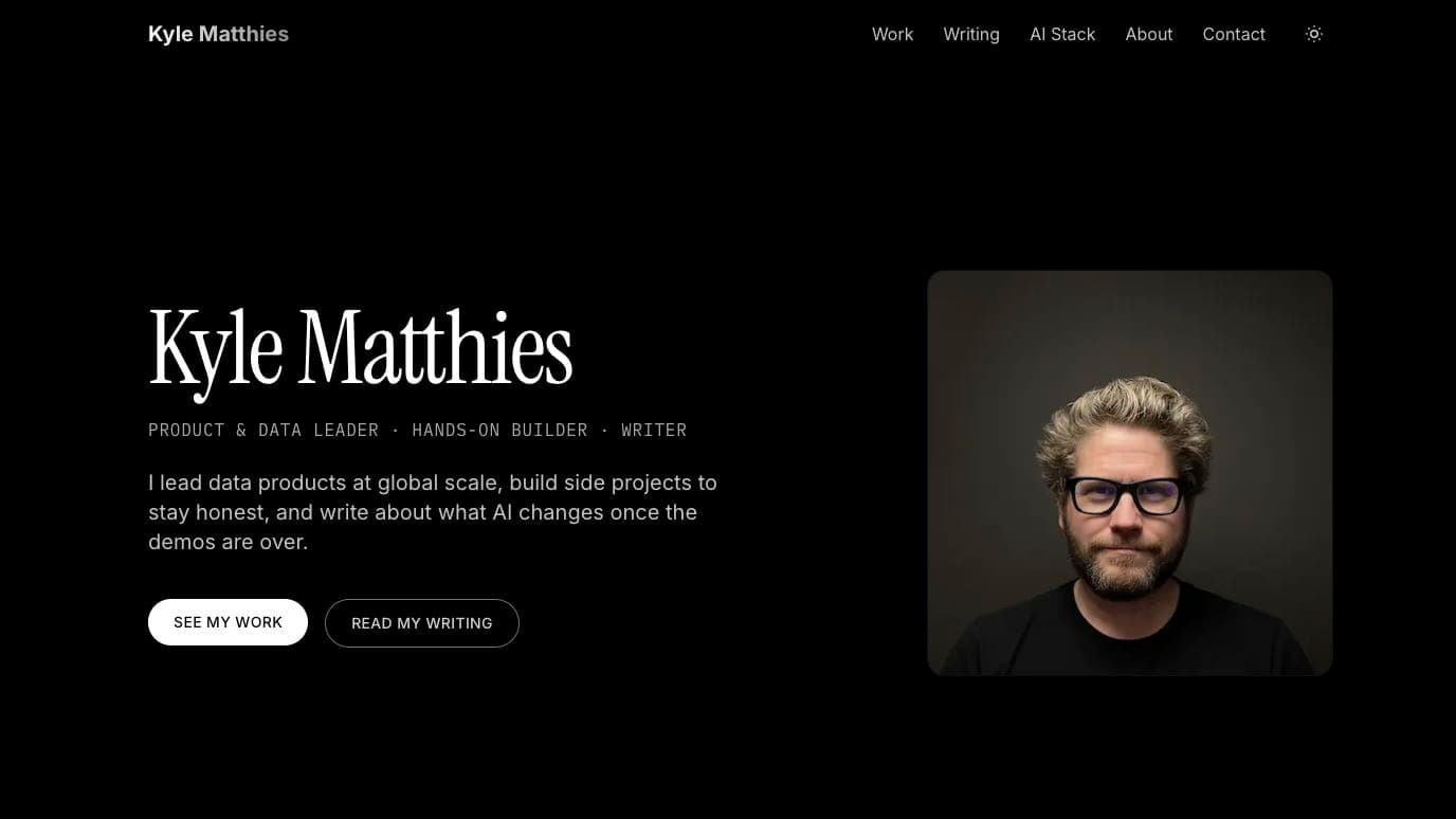
The current homepage with a stronger leadership statement and AI Stack navigation

The Editorial Reset

A feature can be complete and still become the wrong thing to publish. The old Agent Bible was technically impressive, publicly generic, and increasingly disconnected from how I actually work.

What I wanted

I wanted the whole site to reward specificity. That meant retiring the generic agent catalog, publishing the real AI operating model, tightening the leadership story, finishing two strong drafts, and archiving the one that did not earn a place.

What it changed

The site became smaller in concept and stronger in point of view. The evolution page moved from a review artifact into the public proof of that choice.

editorialpersonal brandAI workflow

The current release

The story is ready to be part of the site.

This is not a victory lap. It is the evidence behind the working style on the About page: frame the problem, ship a thin slice, react honestly, and remove what no longer earns its place.